Overwatch League franchise Florida Mayhem have announced a rebranding of their color scheme from the previous yellow and red. With this update, the Misfits Gaming-owned organization have switched to a pink and bright blue, which will be implemented for the 2020 Overwatch League season.
Allow us to reintroduce ourselves. #LightItUp pic.twitter.com/13E2GoQ4nd
— Florida Mayhem (@FLMayhem) January 6, 2020
Florida Mayhem in pink and blue
A video released on Twitter briefly shows the old logo in red. The same logo in a bright neon pink is then unveiled, with glowing blue palm trees in the background. With synthwave or retrowave music playing, fans were quick to notice the similarities to Miami Vice.
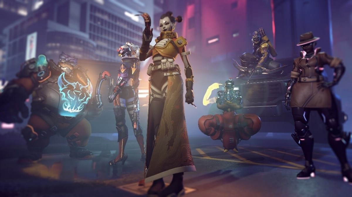
The team later posted previews of what the new colors would look like on in-game skins. The home skin features the electric color scheme, with the away skin replacing black and pink with white, plus the blue with black. Accents on a few specific skins are also dyed pink.
Representing Florida in 2020
These new colors were first hinted at during Season 2 with an alternate jersey that showcased the bright blue and pink on a black backdrop. They were originally used for Florida Mayhem’s Academy team in Overwatch Contenders, but fans liked the color scheme better than the ones used with the main lineup.
The Misfits Gaming organization features a rabbit logo with red, black, and white colors. The team most likely thought to keep colors similar for branding purposes, with the inclusion of yellow as the backdrop color instead of white.
So about those skins… 👀
Here's your first look. #BringTheMayhem #LightItUp pic.twitter.com/lTMSKDgxoq
— Florida Mayhem (@FLMayhem) January 6, 2020
Following this update, the neon blue and pink colors symbolize Florida more. With the start of Season 3 of the Overwatch League, teams are based in specific regions with home and away games. As such, the change of color scheme will help in growing a local fanbase. In comparison, the prior colors resembled Arizona State University or McDonald’s color scheme instead.
It is unclear what will happen to existing skins, but the organization has stated that news will be coming soon. The Florida Mayhem play their first matches of Season 3 against the Houston Outlaws and Philadelphia Fusion. This will take place at The Met in Philadelphia, during the weekend of Feb. 15 – 16.





Published: Jan 7, 2020 07:47 am