The International 2019 (TI9) in Dota 2 will soon take place for the first time ever in China, specifically Shanghai. Given the occasion, Russian esports organization Virtus.pro has chosen to temporarily overhaul their logo. While it usually showcases an angry Russian polar bear, the logo will now feature a Chinese giant panda.
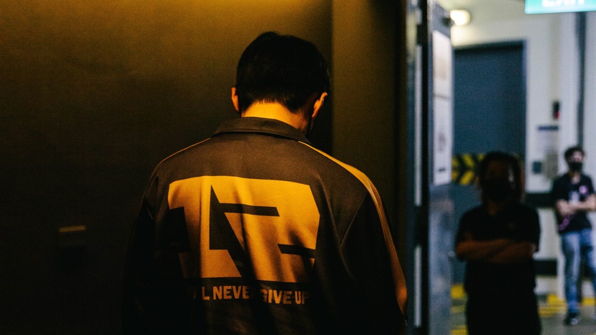
A statement was issued explaining the cultural aspects of the redesign ahead of TI9. In addition to the altered logo, the team’s new jerseys feature Chinese characters. These letters translate to “powerful fight”, a term that Asian fans associate with Virtus.pro due to their growing popularity in the region. Moreover, the letters “VP” are hidden amongst the Chinese letters featured on this apparel.

On top of all that, the jersey pattern “is inspired by the contemporary urbanistic style and takes the form of the letter “V”.”
From Russia with love
Looking at the overall design, it is obvious that – given the large fanbase in China and the upcoming TI9 in Shanghai – the overhaul is a fantastic marketing move. Of course, it simultaneously honors the Chinese tradition by including the Chinese panda.

This is not the first time that Virtus.pro has decided to alter its design. Before undergoing a general alteration to the classic logo of the Russian polar bear, the team also saw a temporary color scheme change before the last The International tournament (TI8). At that time, the purple, green, and black scheme commemorated the addition of a new patron, MegaFon.

With TI9 just around the corner, the new jerseys will definitely be in large demand. Will the temporary overhaul boost Virtus.pro’s chances at a great run at The International? Probably not, but we’ll have to wait and see.
What do you think of the new design? Let us know down in the comments below, and as always, follow us at Daily Esports for all the latest news in Dota 2 as well as other major esports.


Published: Aug 8, 2019 10:00 am